About Kollektiva
Kollektiva is a rental website for retired people who want to expand their social life by renting out part of their home. This project was a collaboration between YRGO and the founder of the Start-up company Kollektiva. The design was made by Isabelle Dubar, Matthew Blaxland and Linnea Calmstierna. The web development was made by Emma Hansson and Jennifer Andersson.
Research
In this project we focused on research, user friendliness, user journeys and user testing. The goal of the project was to reduce the housing shortage in society and loneliness among the elderly by getting people over the age of 60 to rent out part of their home.
We did an extensive research and were inspired by other rental sites. Our inspiration was retrieved from Blocket bostad, Bostadsportal, Bo tillsammans, Hemnet and Airbnb. What inspired us from the mentioned pages were their visual expression, language to the user and structure of the pages.
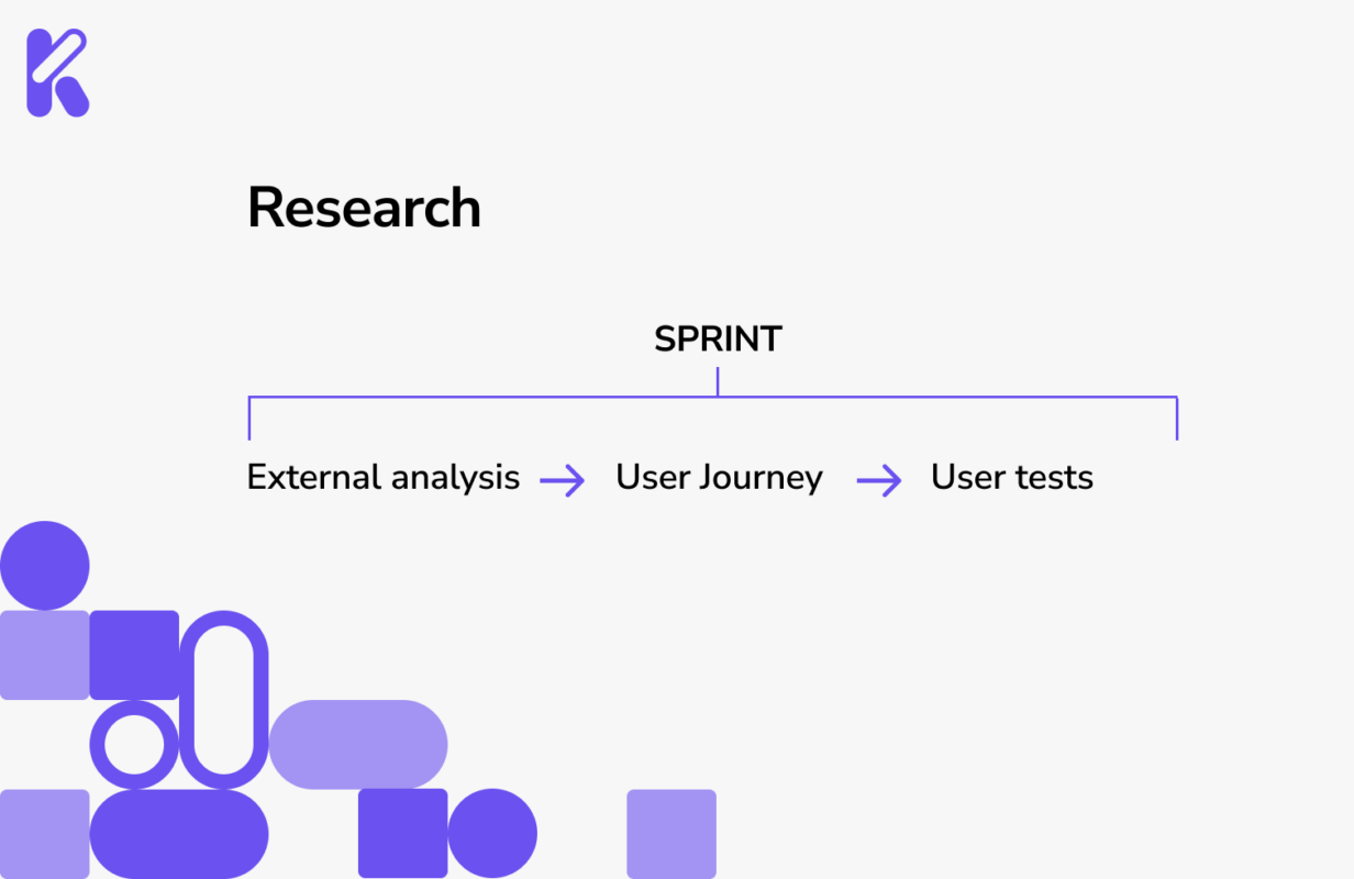
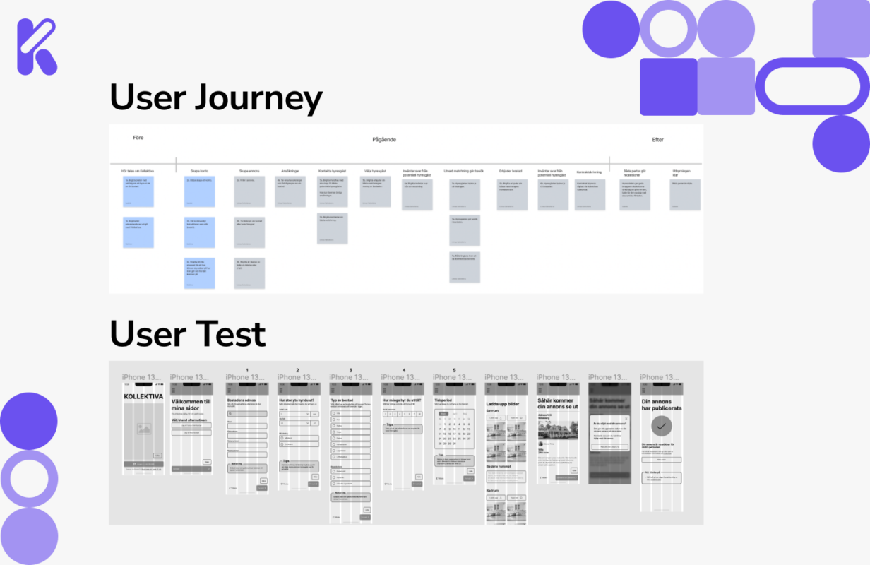
We wrote down some questions that we reflected on during our research. What would the service look like for an elderly person who wants to rent out part of their home? What problems may arise that we want to prevent? With those questions in mind, we made a schedule for the project and made a flowchart. Then we made greybox/wireframes into a form for advertising. We made user test early in the process and made some changes before we designed the user interface. During the first sketches of greybox, the web developer began to code. We kept in daily contact in the working group and made sure that everyone felt involved from start.
Insights
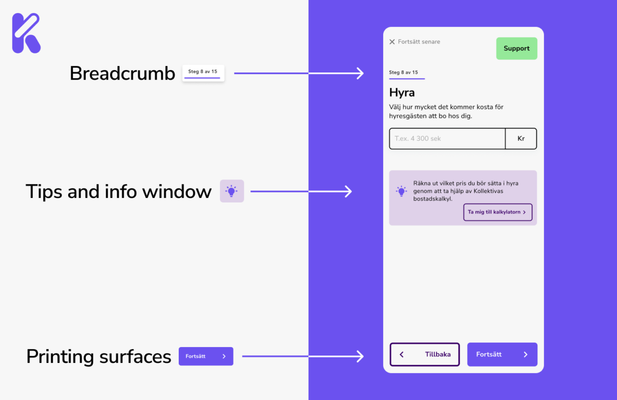
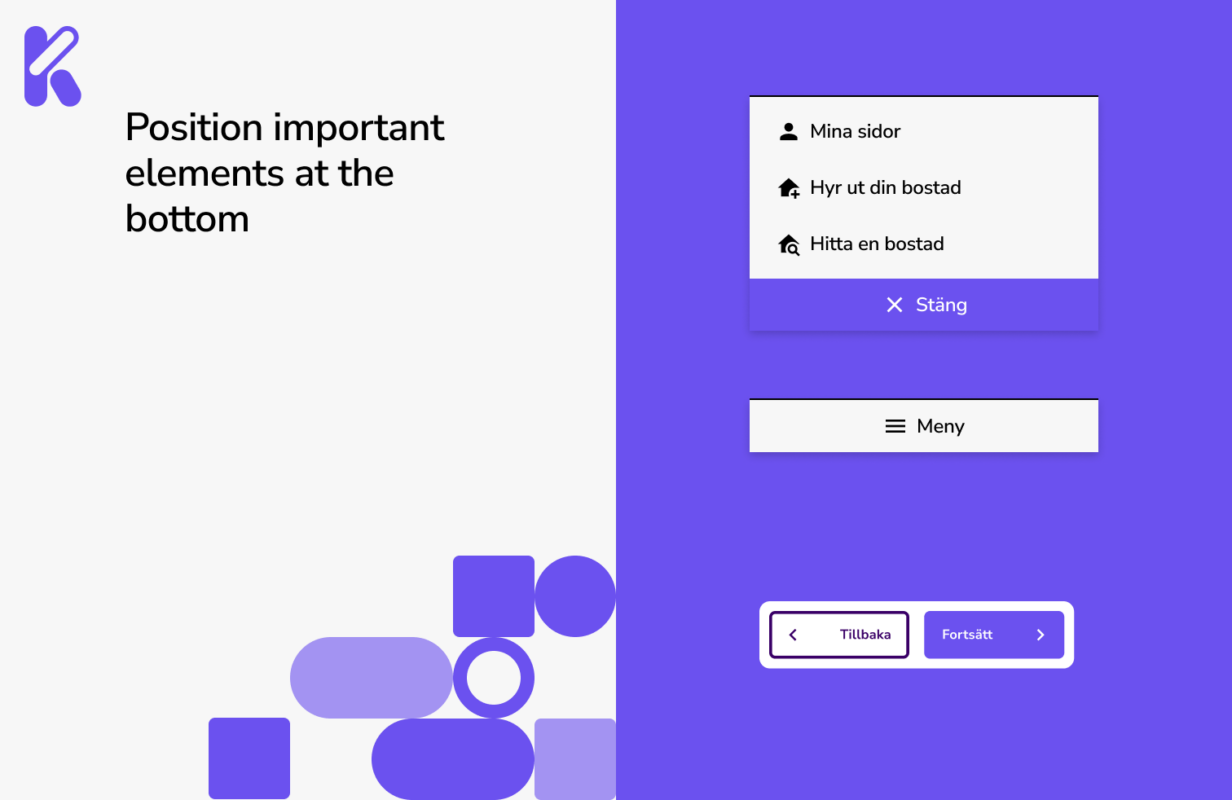
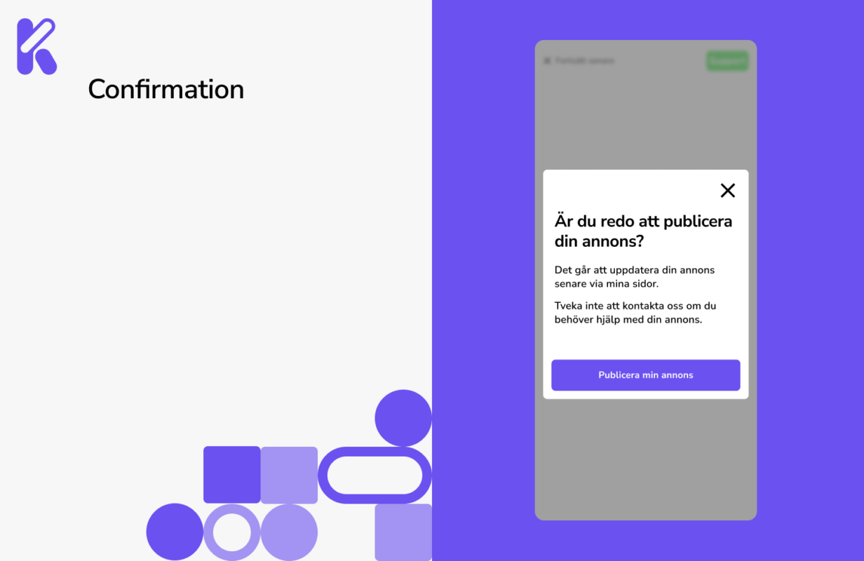
The user test made us do some change in the form. We shortened the texts. The less information, the easier it was for the user to understand the questions. We wrote clearer copy. We added bredcrumb to every page in the form so the user knew where in the form he/her was. We wrote some extra information that made it easier for the user to understand and fill out the form. We added a back button so the user could go back and do some changes without closing the form and start over. We placed the most important elements in the bottom. It made it easier for the user to hit the buttons while scrolling. We also added a confirmation so that it was clearer to the user when the ad was published.
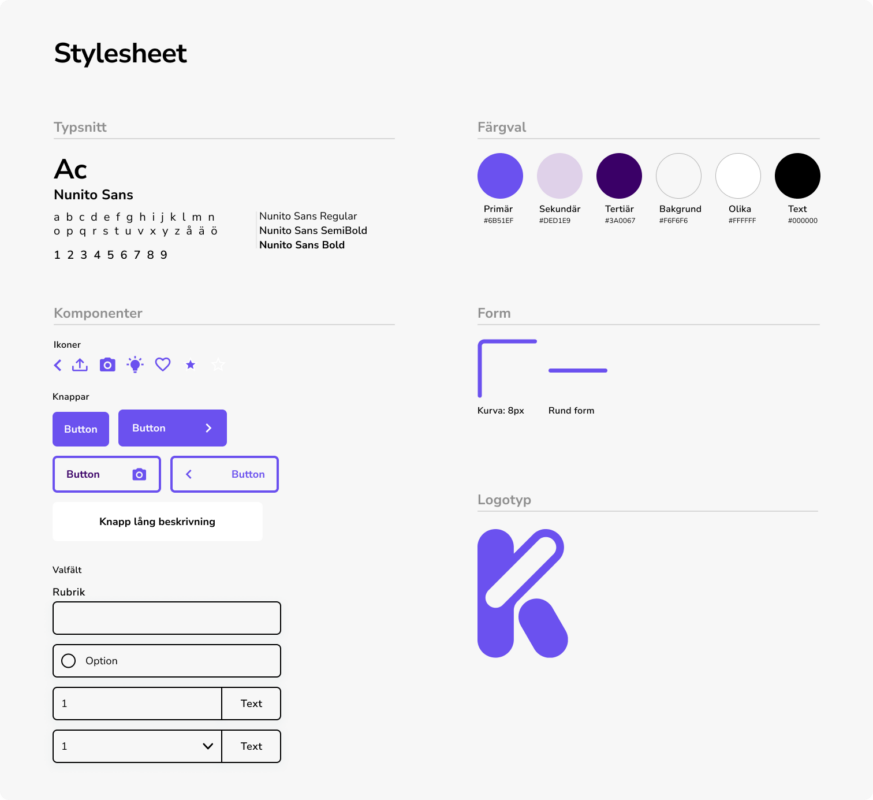
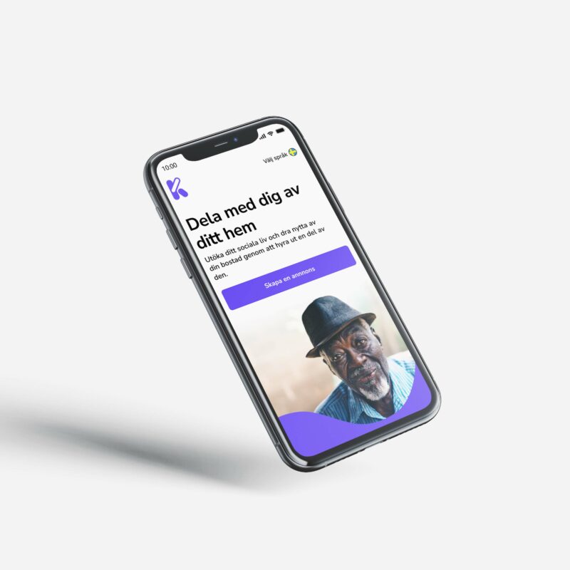
User Interface