
Graphic identity & website
A collaboration between YRGO and Chalmers, Tom-Christian Stokka and Linnea Calmstierna have created a new graphic identity for the start-up company Vesiro. Vesiro is a tech company that works to reduce energy consumption and increase the speed of servers. Their unique software increases the speed of servers by as much as 100%.
Research
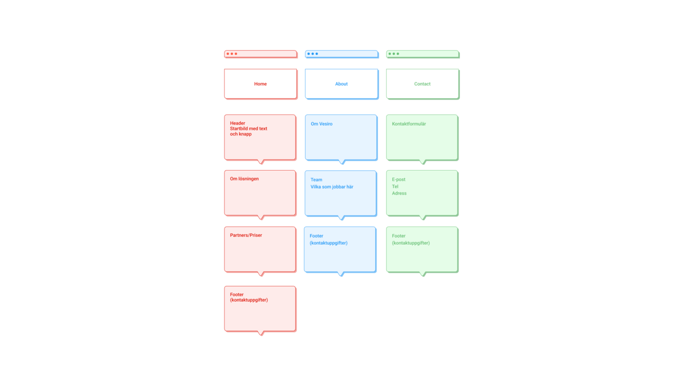
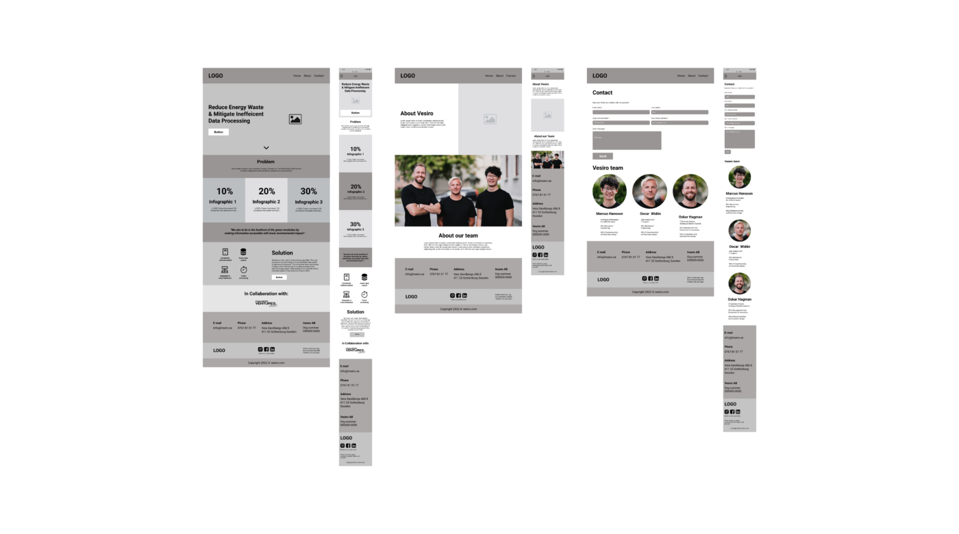
In the beginning of the work process we did a lot of research. We looked at start-ups and tech companies websites, Pinterest and Behance for inspiration. Then we created a flowshart, greyboxes and user interface.
Insights
In our first meeting with the client we talked about the brand name. The domain address insero.com was busy and since the company is targeting an international market, an address ending in .com would be more appropriate than .se. Therefore, the company decided to change the name after our feedback.
We did user tests that made us do some changes on the website. For example, we changed the order of the content to create a clearer picture for the user of what the product is about.
Flowshart
Greybox
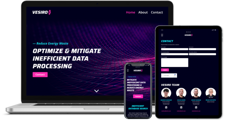
Graphic Design
According to the customers wishes, we have created a website with inspiration from the 80’s disco. The design is very tech inspired, youthful but still professional.
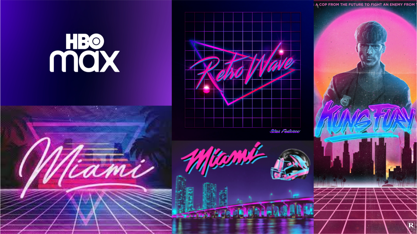
Inspiration
We were inspired by 80’s disco and high tech products.
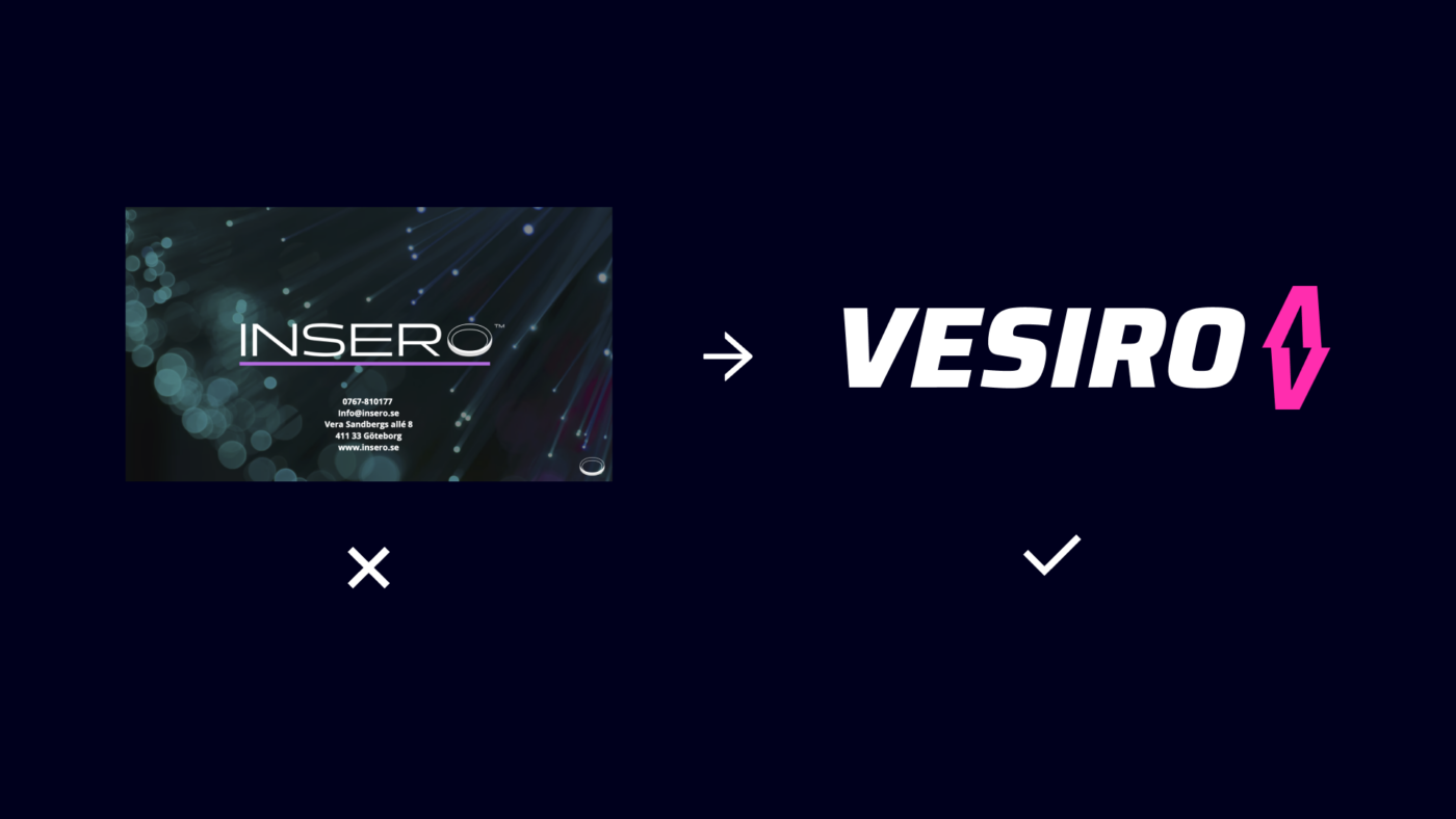
CHANGE OF COMPANY NAME
We made a new logo for the company due to the name change.

Background images
For the background on the website, we used images that give a feeling of high tech. The images represent servers and abstract illustrations with neon lights.
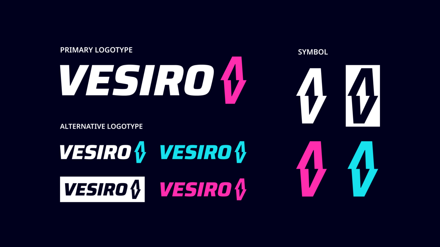
LOGOTYPE
The font has italic letters to create a sense of speed. The icon consists of the letter ”V” which is upside down (x2). The letter forms a flash that gives associations to electricity and speed.
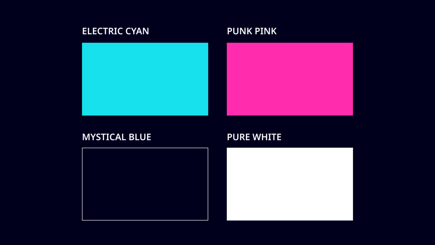
Colors
The colors are inspired by neon lights and 80’s disco.
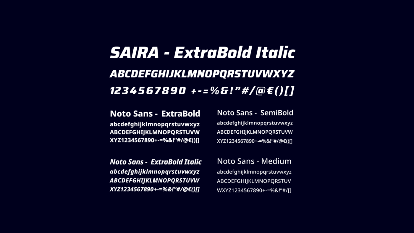
Font
The headlines are in italic to create a sense of speed. The body text is easy to read and fits both digitally and in print.
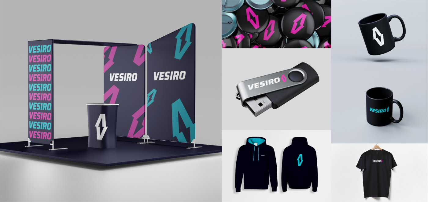
merchandise
We applied the logo on products that the company can use for marketing purposes.
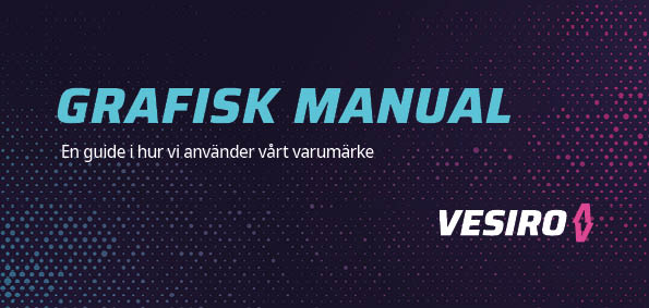
Graphic Manual
The purpose of the graphic profile is to unite the employees view of VESIRO so that they can give a uniform expression to the market.